
|
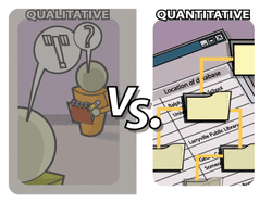
WHAT IS QUANTITATIVE DATA?
Quantitative data is data in the form of numbers.
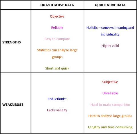
This includes number scores, rankings, tally marks, percentages, statistical measures and various types of graphs. You could remember that quaNtitative involves Numbers whereas quaLitative involve Letters. The main advantage of quantitative data for psychologists is that it is objective - numbers mean the same thing to everyone and you don't need to interpret them personally; this makes quantitative data very reliable and highly scientific. Another advantage is that quantitative data is good for making comparisons. This is particularly important for the experimental method, which involves comparing the DV for different conditions of the IV. Quantitative data can be turned into statistics, which allows detailed comparisons of large groups and the identification of trends. Finally, quantitative data is simple. Numbers can summarise data very quickly and with little space whereas descriptions in words may be very lengthy or time-consuming. This applies to collecting the data in the first place as well as studying it later. The main drawback with quantitative data is that it is reductionist. This means it simplifies too much. A lot of detail and meaning is lost when human experience is presented quantitatively. Two participants may get the same scores, even if they got those scpores by doing very different things.
Because of this, quantitative data may lack validity: it may not tell you what you want to know and it can even be quite misleading. For a lot of people, quantitative data tells them nothing at all! 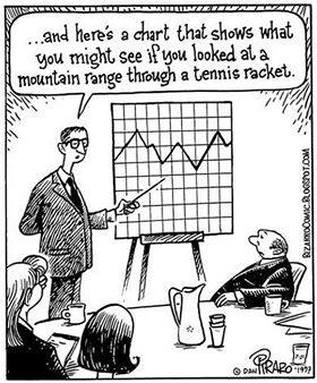
If you compare the strengths and weaknesses of quantitative data to those of qualitative data, you will see they are opposites:
|
|
ANALYSING QUANTITATIVE DATA
You learned most of what you need to know about analysing quantitative data at primary school or the early years of secondary school.
Descriptive statistics are the straightforward calculations that analyse a sample of numbers. You should recognise the mean, the mode and the median; standard deviation might be a bit more obscure. These, and the graphs based on them, are explained below. Inferential statistics, which use a data sample to draw conclusions about the wider population it was taken from, are a bit more complicated and are discussed elsewhere. 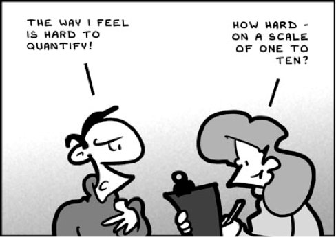
MEASURES OF CENTRAL TENDENCY
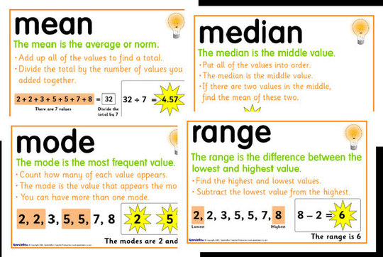
There are three simple statistics you already know: the mean, the median and the mode.
The mean is the average of a set of scores. You calculate it by adding the scores together and dividing by the number of scores in the set.
The mode is the most frequent score in the set, the one that occurs the most often. It's useful for showing the most popular or common result.
The median is the central score, the one(s) in the middle when the scores are all ranked in order, highest to lowest. If there is an even number of scores, then the median is the average of the two middle ones.
MEASURES OF DISPERSION
These are slightly more complex statistics, but the simplest is something you already know: the range. The other is standard deviation.
The range is the difference between two ends of a set of scores. You work it out by taking the highest score and deducting the lowest one.
Standard deviation is a bit more complex. Standard deviation is a more sophisticated way of looking at the mean. If you arranged everybody's scores in a line, you'd expect them to "bunch up" around the mean and "thin out" as you get further away from the mean. That's usually what happens.
If you did this as a graph, it would be a curve that looked like a bell - a "bell curve". The "lump" at the top of the bell is where most of the scores bunch up, the flat ends to the left and the right are where the less common scores spread out. This pattern is also known as standard deviation. 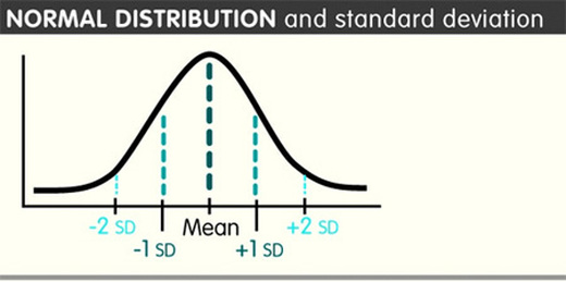
So if the mean is the lump in the middle, there are a bunch of scores that are pretty close to the mean to the left and the right.
All the scores up to 34% lower or 34% higher than the mean - that's 68% of the set in total - are one Standard Deviation (1 SD) away from the mean. Being within 1 SD makes your score pretty "normal" statistically speaking. Another 14% (so, 35-48%) are higher and lower than that: we're talking 96% of all the scores who fall within 2 SD of the mean. Being within 2 SD makes you "unusual". Then there are the people who fall outside the 96%, the ones in the bottom 2% and the top 2%. These scores are 3+ SD away from the mean and count as "very unusual" (or just plain "weird"). You can calculate standard deviation by following these steps:
Standard deviation is a relatively quick (!) way of telling if any particular score from your set is normal - if it's within ±1 SD of the mean.
However, this only works if you have standard distribution (clue: the mean and mode are very similar): 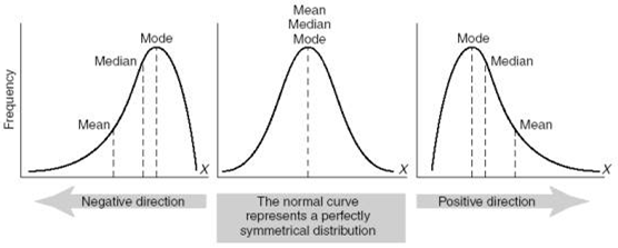
If the mean is a lot lower than the mode, you probably have negatively skewed data; if it's much higher, you have positively skewed data.
Standard deviation is not helpful with a skewed distribution of data. CALCULATING FREQUENCIES
Often, your data is a set of scores, but sometimes it is a set of tallies or frequencies instead. This is known as nominal level data.
You might collect the data as tallies. For example, you could count the different types of pets classmates have. 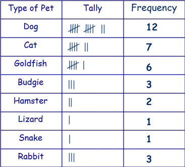
You can't work out a mean from this level of data, but the mode is very useful (dog is the most common pet).
You could also collect the data as scores (known as interval/ratio level data) and then turn them into frequencies by putting the scores into categories. For example, you could find out how many cups of coffee other students drink each day and turn that into frequencies. 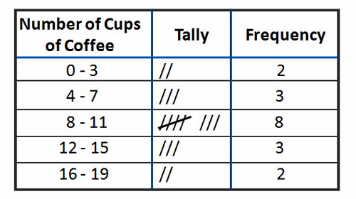
Notice that it's up to you how to group the frequencies. If you grouped the coffee as 0-7, 8-15 and 16+ you would have fewer categories but much bigger frequencies (5, 11 and 2)
You can turn frequecies into percentages quite easily:
|
|
GRAPHICAL REPRESENTATION OF DATA
When you carry out research, you end up with "raw data", which is each participant's scres or a table of tallies. It's tempting to make a pretty graph out of this.
DON'T DO IT. No one wants to look at a graph of raw data. Why would they? They could get the same information off the scores themselves and it would be less confusing. Graphs should interpret the data. They should help you see patterns in it that you would miss if you looked at the raw data. There are lots of graphs to choose from, but only two are mentioned in the Specification: bar charts and histograms. BAR CHARTS
Your measures of central tendency and dispersion can be turned into a bar chart.
A few rules for bar charts:
HISTOGRAMS
Frequencies can be turned into histograms.
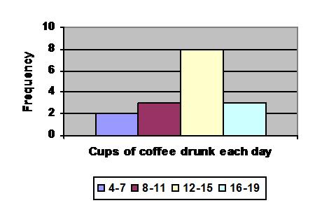
A few rules for histograms:
|
|
APPLYING QUANTITATIVE DATA IN PSYCHOLOGY
|
|
EXEMPLAR ESSAY
|